I got invited to do a guest lecture on storyboarding for a friend who teaches a "Fundamentals of Video Directing" class, which in turn gave me a chance to finally get around to reworking and refining said segment for my own class. I only touch on storyboarding for just one session during the summer "Cartoon & Comic Art" class if and when time allows - it's such a fun and lucrative skill for sequential artists, and with the advent of DVD special features more and more folks are seeing just how valuable a tool it is to film production and project pre-visualization.
My own angle for this particular class was to emphasize some basic fundamentals of drawing, mainly composition: the same underlying principles that go into a good drawing apply equally in composing any given scene, whether it ultimately evolves into a moving picture or remains a static image. So the elements of design such as fore/mid/background, overlapping, foreshortening, linear + atmospheric perspective, framing and cropping, zooming in for tight shots for detail, zooming out for establishing shots, environmental cues for context, interesting and unique camera angles (POV, OTS etc.), contrast (shapes, and light + shadow will all factor in for a successful composition. I learned the term "key frame" which would be where all of these considerations coalesce into one image - this is interesting to sift out by advancing frame by frame through a favorite sequence. Or even an entire movie, if one has the time.
A storyboard artist has to first & foremost clearly communicate the intent of the director - this visual information provides all the other people with the raw material to begin designing and constructing sets, costumes, camera positions, lighting, funding, equipment allocation, scoring and immeasurable guidelines for the actors themselves. As with any artform, this can be done employing a wide range of styles and techniques, which I introduce by previewing excerpted highlights culled from my own collection. Only a relative fraction of DVDs include this bonus material, and many directors (including some of my favorites) don't use storyboards at all in their productions. It largely depends on the inherent complexity of any given scene - two people having an intimate conversation over dinner is vastly easier than say depicting a full-scale battle sequence involving hundreds of extras and mammoth sets. But even a solitary director on a low-budget film will find effectively doing the film first on paper just as an exercise will help clarify and consolidate various cinematic processes before the camera even starts rolling, which will save on considerable time, effort and money.
There are some directors who do finished storyboards themselves, or if they aren't particularly talented in that regard, they'll employ other, more skilled artists to translate their initial roughs into the closest approximation of their creative vision. To these ends I tried in my presentation (and to a limited extent here in this posting) to both inspire and inform through showing a pretty good spread of varying abilities and styles.
Tech woes threw up a few speed-bumps: copy-protection and impotent software derailed my original intents of ripping brief sections of films and compiling them all onto one DVD. I've long since gotten over looking like a dork while trying to juggle loading movies and locating the particular relevant sequence for the waiting audience, but I still resist the academic equivalent of electronic babysitting by plunking a class down in front of a screen. Nice to be in a class where that was par for the course - almost as cool as reading comics! But it would have been nice to have everything all put together in one place so as to facilitate an easier lesson - you'd think allowances could be made in the case of legitimate educational purposes for classroom usage. Even the "Grab" program wouldn't function while the DVD player was open, so I resorted to the old-fashioned manual technique: snapshots with a digital camera + cropping & clean-up in Photoshop. With hindsight I actually appreciated the isolation of these images separate from the context of motion and sound, which are equally crucial aspects in the total film viewing experience but can also overwhelm analysis of the underlying infrastructure.
A little laborious but well worth the effort as the end result was over several hundred stills that all added up to a pretty decent overview.
A little laborious but well worth the effort as the end result was over several hundred stills that all added up to a pretty decent overview.
More details after the jump...
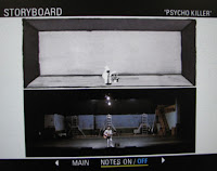 First up on the smörgåsbord of possibilities is handful of images from the landmark concert video "Stop Making Sense" (1984, Jonathan Demme) featuring the Talking Heads. Choreographing the unobtrusive and gradual buildup of incrementally added equipment, scaffolding, platforms, musicians and singers, plus the overall set design is made easier to understand through David Byrne's simple but effective drawings. Granted, the contemporary music scene has undergone insane changes what with Michael Jackson/Brittany Spears scale-sized productions now fairly commonplace in the industry. But back in the day this film was a paradigm-shifting experience. Yeah, I'm dating myself...
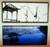 For a great comparison in stylistic and cultural differences, there's the Chinese film "Hero"(2002, Zhang Yimou) which uses beautiful brushwork to get across the passion and finesse of two swordmen engaged in aerial gymnastics across the surface of a mountain lake. Even the delicate dip of a sword-tip into the water is executed with simplicity and minimal, zen-like linework. Proof of the "doing more with less" maxim. This was one of a series of films that really glommed onto using wires for special effect sequences that had actors flipping all over the place - crucial to think through the complex moves out on paper to prevent leaving them literally dangling while trying to work out details on-set.
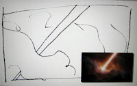 "Hellboy" (2004, Guillermo del Toro) the screen adaptation of Mike Mignola's comic hero. Shown here is a perfect example of the director's initial efforts at sketching out an idea, then a more refined rendering in the hands of a better artist - in this case, Simeon Wilkinson. This set of drawings looked as if they were lifted directly from the pages of a comic book, minus the directional arrow cues, and illustrate the speed and skill sof ome of the top-tier talents. That said, there is a big difference in making the leap from drawing a comic to drawing storyboards - they are very similar in many aspects but the end result relies on completely different cognitive processes on the part of the viewer, and thus there are wholly different approaches to take visually when it comes to imparting visual information
Next I focused on a trio of films by English film director Ridley Scott, who has more than anyone else revolutionized the concept of a "director's cut." His lavish, limited-edition 4-disc collector sets are a treasure trove of extensively detailed and comprehensive documentaries and commentaries - a geek's dream come true for trivia.
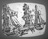 "Alien" sci-fi/horror classic (1979) for which the studio doubled the budget (from $4.2 to $8.4 million) based on Scott's initial drawings. This points up the value of a background in visual art, having earning a Masters in Design from the Royal College of Art, this guy can actually draw. There are two sets of storyboards, known as "Ridleygrams," that show a progression from loose sketches to tighter, more complete images which are in turn handed off to Visual Effects Supervisors and others who set about fabricating 3-D versions based on these concepts.
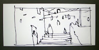 The Crusade epic "Kingdom of Heaven" (2005): more fabulous sketches showing an in-depth working familiarity with linear perspective and period design. There are again two levels of storyboards from Scott before the reigns are handed over to another artist, Cristiano Donzelli. Another term I picked up on in this class was what is referred to in the industry as an "illuminated script" - shown here to the right - basically where the director has compulsively doodles out directly onto the pages of the script. This brought to mind comparative approaches in the comic book industry between the Marvel method and the traditional full-script D.C. variation.
 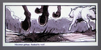 "Gladiator" (2000) Buried amongst the four volumes of supplemental material is a disc entirely devoted to storyboarding, including a documentary demonstration of artist Sylvain Despretz. He gives us a hands-on talk-through of his techniques while offering a candid insight on the process of working in the industry plus meeting and anticipating the expectations of different directors. Watching this professional handle the tools of the trade while keeping up a running commentary from his many years of experience is the next best thing to having him right there in the classroom. So many of the individual storyboards for this movie can stand on their own as finished illustrations, and they dramatically showcase the importance of contrasting areas of light + shadow, interesting camera angles and compositional confidence.
  Perhaps the most insane of all DVD sets ever manufactured (the 208-miniute "Platinum Series Special Extended Edition"), "The Lord of the Rings: The Fellowship of the Ring" (2001, Peter Jackson) sets the bar for massive behing-the-scenes information. Jackson began working with storyboard artist Christian Rivers almost five years before the film was released - not to mention the epic scope of the entire trilogy which consumed eight years and a budget of $285 million. Orchestrating a veritable army of We also briefly touched on the newest thing in pre-vis technology: animatics, which take the next step in digitizing drawn storyboards and adding temporary voice-overs + stand-in scores to get an even better idea how timing and pacing will evolve.
  "Open Range"(2003, Kevin Costner): There is a specific documentary included on this DVD that features storyboard artist David J. Negron Jr. and his work on this film. Stylistically a perfect mesh with the Western theme using warm sepia tones to portray real antique flavor to the images. Negron spends a lot of time on-set revising his storyboards and like many of the other artists mentioned so far, is hand-in-glove with the director while working out virtually every aspect of the film beforehand. Again, when part of the crew involved herding hundreds of cattle and acting from horseback, it's prudent to work out as much of the detail beforehand as possible.
Continuing on in the Western genre we set up an exercise comparing and contrasting an iconic and identical key sequence at the heart of these two films: the climax at the Gunight at the O.K. Corral. Both films have ensemble casts and employ no small measure of logistical choreography to present this showdown in all its blazing glory.
"Tombstone" (1993, George Cosmatos) employed the talents of David Russell in plotting out this take on the infamous lowdown His sketches reflect a nice rawness that lend themselves to the gritty flavor of the film. Lots of cut-aways to establish the town, observants, and also set the stage for easily identification and positioning of the principle characters. Quick, tight shots capture facial expressions and props to give the viewer an immediate impression as the setup is slowly revealed.
 The differences between how each film goes about building up the tension until the payoff is very subtle, and studying these stills is revealing in which of the two films utilize slightly different solutions in their respective takes on the same event. It's a thin line between proven, effective shots and worn-out clichés: the history of film is full of homage and/or outright appropriation between artists searching for inspiration. And ya just gotta dig them awesome mustaches.
  In my humble opinion, the far superior film which came out a mere five months later is "Wyatt Earp" (1994, Lawrence Kasdan). It's full of little moments of cinematic perfection and is one of the class of films I regularly rewatch just to appreciate from the standpoint of craft. Evidence of this is in how there's at least an additional dozen separate key shots culled from this film versus the other. Taking the time by showing beats where details are covered, however fleeting, can be so important to the general impression: take a look at the two samples shown here for example. The slow pan starting with focusing on the boots is a nice touch, and the capturing of cast shadows in especially sweet. This is the difference between simply "okay" and something "well done."
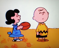 We culminate the class with a brief exercise based on an excerpted sequence from the beloved "It's The Great Pumpkin, Charlie Brown" (1966, Bill Melendez), chosen in part due to familiarity and universality of the story and additionally the greatly simplified imagery and style which is easily within reach of most folk's ability to copy. Sure it's a wee bit heretical to mess with an American icon, and Schultz is probably rolling in his grave, but his longtime collaborations with Melendez provide us with perfect material to explore the factors which shape interpretations of a film. As a side-note, I always love pointing out the panel to the right: that precious moment of pure joy on Charlie's face is usually overlooked in the all-too brief second it's flashed upon the screen.
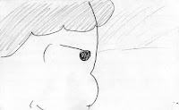 Students were given a minimum of five blank white index cards on which to sketch out rough shots that would completely recast this childhood classic into a much more compelling and visually interesting narrative. The idea was to impart a sense of dramatic tension and mounting conflict, and Peanuts was used due to it's universality and it's almost painfully boring layout. The camera never waivers from eye-level side-views, which makes for much opportunity to experiment on how much the atmosphere of storytelling can be changed with just a simple shift in composing different angles.
Sheriff Brown versus the outlaw Van Pelt
Some of the more notably creative (and amusing) concepts were: tight shots on squeezing the pigskin, glints, the football reflected in Charlie's eyeball, beads of sweat, Clint Eastwood-esque squinting, birds-eye + worm's-eye shots and some very unique framing/composing ideas. It could additionally be seen how assembling a roomful of talent and unleashing them on a concept can result in some fantastic directions: afterwards it's always interesting to selectively edit one or two key frames from amongst the posted results and assemble a separate, new sequence using the best ideas of the bunch. Taking this approach to their own projects and collaborating amongst themselves for fresh input and ideas is a way to start learning how to do this fascinating genre of sequential art.


No comments:
Post a Comment