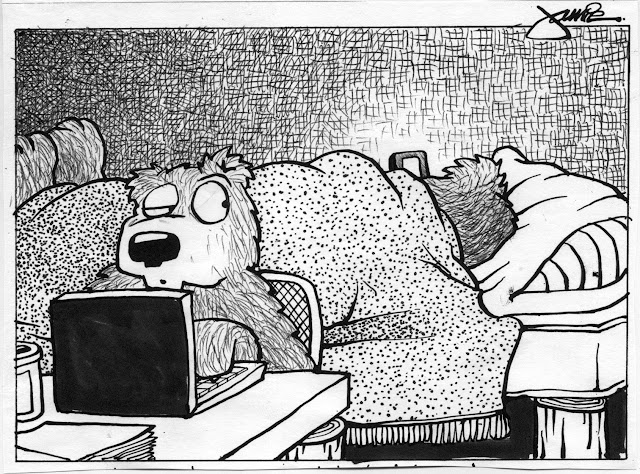
Once gain I am reminded of the words of wisdom imparted to me by a previous instructor: "The only difference between you (his students) and myself is that I'm just standing on a bigger pile of mistakes." Meaning that he could therefore see farther and simply take in more. Now so many times in the classroom I wonder whether or not an aspiring talent has not the skills and ability, but the discipline required to generate the requisite mountain of pieces that are part of the process. Or, less charitably in my case, whether or not they are just too damn stubborn (maybe mixed with a touch of inherent stupidity) to give up.
Bonus satisfaction when it doubled as a demo: showing how each and every aspect of making work like this is the what and the why we have been doing with all these in-class exercises, assignments and critiques for Beginning Drawing. Join me below the fold for another exhaustive, step-by-step breakdown of the process behind this piece...
This doodle definitely earned the label "thumbnail" rough since it was on a 3' torn section of scrap. But everything's already there in embryonic form.
First pass at the paper with pencil: quick blocking in of basic, simple shapes.
Beefing up the contour lines once the composition is dialed in. Typo merited a digital fix later on.
Aftre scanning the linework, I made print, then a few xerox machine reductions off of that. These test runs were used for a couple texture combo experiments - posted below in this thread - and this one here that's a value study using graphite. Fixed the typo but still now need another entire word added.
Nice "soft" digital shading. Also all the typo issues in caption corrected with Photoshop. The only remaining step along the process is opening up the Sunday paper and see how well it worked printed on newspaper rag. I'm hoping the substrate will enhance the richness, range and depth of the value.
One of two photocopied tests for experimentation with several different combinations of textural effects. They were reduced to about a few inches wide - don't want to invest too much time on this little side thing. Made with black ink ballpoint pen (scumbling, hatching) + Sharpie (stippling).
Second of two pen & ink texture tests, made with black ink ballpoint pen (hatching, cross-hatching) + Sharpie pen (stippling).
Below is the final version (Strathmore 400 series Bristol, 9x10"), made with dip-pen & India ink (for the contour line) + 005, 01, 03, 05 and 08 Microns (for everything else). Really really really wrestled with whether or not to apply judicious areas of wash. But keeping it line-only won out, plus there's something more than a little gratifying to bang one out in this style and still do a decent job. It's like paying your dues to the traditional way of making marks - by hand. It's an homage to the immortal greatness of Sendak, and a little Crumb, and more recently, the recently passed Ted Stearn.


No comments:
Post a Comment