If I laugh at inappropriate moments while out in public it's not maybe not so much a case of creeping insanity as it is a simple sign of failing hearing. Casual conversation is the motherlode of inspiration, and aside from eavesdropping in cafes, the basic encounters of an average day provides more than enough fodder for funnies. So that slightly glazed, detached expression on my face when you're trying to talk to me just means I'm working.
The process posted here is a good example of how an initial idea sometimes will benefit from incubation and reworking so as to develop a cleaner composition. Even in the difference between the wash and the digital versions you can see some subtle tweaking. I honestly have no druthers either way as to which particular manifestation is "best" - some folks like the doodle, others the original, and for many the published print version appearing in the newspaper is all they ever see, and that works just fine.
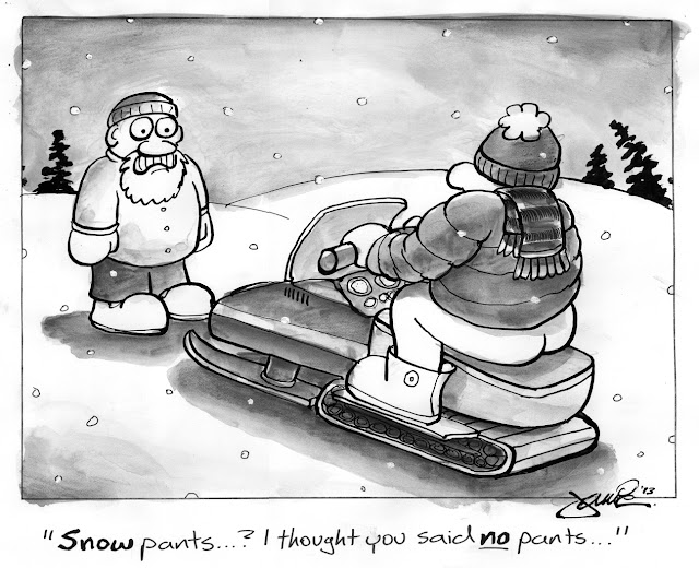
Strategic arrangement of the elements even within a single-panel cartoon can facilitate the factors which enhance the experience as per a work of "sequential art." That is to say, much in the manner a traditional comic strip paces out the timing + delivery of the visual and verbal aspects so as to manipulate the perception of passing of time through the usage of gutters, here we have a demonstration of how the same effect can be achieved within the confines of a single frame. This cognitive interpretation takes place in a fraction of the time given the compressed "real estate" of a gag panel, but it's still there: from left to right/top to bottom: first the expression of the observer which sets up an connective entry point with the eyeballs and foreshadowing expression (whether the human mammal instinctively visually initially orients to depictions of eyes or the tendency of the Western reader to process information on a printed page beginning in the upper left corner is debatable - these could just reinforce each other); then the viewer's eye is directed via gaze cuing ("joint attention") to the second figure, and is then drawn to the second, compositionally counter-weighted focal point of the butt; in part through use of contrasting value (that and it is a bare ass, which would normally merit a second look from incongruity - a distinct theory of humor); and for closure the gaze drops to the caption. Which is also another component in the overall effectiveness of the cartoon - it's a basic pun. Both the image + text operate independently but the reader concurrently arrives at the joke with each aspect functioning hand-in-glove to support the "ah-ha" moment of resolved expectations.
Whew, cartooning is hard work. But seriously, normally this degree of deconstruction isn't beaten out beforehand - it's part and parcel of the overall process on how best an image and idea is edited down for the fastest way of "getting it."


Maybe he should be wearing a thong or something
ReplyDeleteWell, who's to say he isn't?
ReplyDeleteNo... eewww... nevermind.