Half a dozen years back I had to admit I was wrong in at least one instance when it came to "legacy strips" (aka zombie strips) what with the awesomeness that is now Nancy Now I gotta say it again: sorry, I stand corrected, as there's now a new recent favorite that been making my day a lot as of late: the now-fifty year old feature "Heathcliff." Also, I continue to be humbled and amazed at the breadth and depth of new stuff that is continually coming out in popular media, be it books, movies, music or art - especially in comics. It's hard to keep up especially when one's tendency is to slowly surrender to solipsism as an artist, and focus more on your own output. But as John Muir once said: "When one tugs at a single thing in nature, he finds it is attached to the rest of the world." (*Update: erroneously misattributed quote). And so staying aware of the connections that can be drawn in art is not only important for history, but as we'll see shortly, can be crucial to staying open to change and inspiration in ones own work. So let us tug at the cat tail.
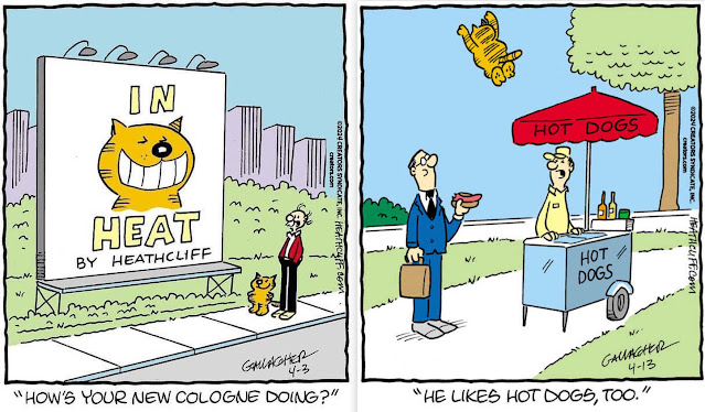
The original creator of the original orange cat was George Gately, who retired in 1998, as did his assistant John Gallagher. Nowadays their nephew Peter Gallagher is in charge of cleaning the creative litterbox that is coming up with the current cat cartoons. Posted above here are the first two panels I saw of his that hooked me into following the feature: the first ("In Heat") immediately told me that, hey waitaminite, this was something else entirely different, not the least in content, and was one of the rare times I just laughed my jaded ass off. The second panel ("Hot Dogs") is when I officially fell in love with the character - that total-air body launch is one of the many endearing tropes regular readers look forward to. Others would be Jimmy the Frog, the helmet, meat tanks and gorillas etc. - as I tell new readers, just stay with it, even if it doesn't make any sense at first, or at all, as it can get delightfully surreal sometimes.
Here's a selection of interviews, one from Solrad and another from Uproxx, and in particular this "Comics Culture" video from Terence Dollard's informative channel, that give some more insight into Gallagher's process of both idea generation and making the art (including going from roughs to finished piece, techniques etc.), and his weekly workflow. He also speaks to the comparative advantages of doing a single-panel gag format, which was personally validating for me, not to mention insights coming from another established professional in the industry who also teaches at a local university). Oh and yeah, oranges.
Aside from all the this fan-boy stuff, I had a small epiphany after becoming increasingly curious as to Gallagher's usage of color, which appears, along with his linework, to be very simple. A limited and subdued palette consistently of desaturated pastels, without any cuts for contrasting value (say, like for cast shadows) or even much of a range like for example in gradations to show an object's volume, or to enhance pictorial depth. While after much study, reflection and experimentation, I don't think I could restrain myself and my coloring instincts and not employ those same techniques, but in retrospect, I have a lot to learn about restraining my tendency to make my own panels appear overworked ie too "Photoshoppy." Ironically that's what turns me off from so much if not most of contemporary color work done especially digitally, and you can imagine the horror at the sudden realization that you are actually aesthetically repelled by most of your own work. This is similar to the reaction most artists have at looking over their own material, except I'm very much effectively still right in the middle of incorporating it into my own material, as it's only been within the past few years that the ratio of color versus black & white panels has flipped, and now the vast majority of my cartoons are in full color.
One of the interesting perspectives you can gain from seeing your work displayed in a show, particularly retrospectives when everything’s up on the wall, is the cumulative gestalt experience in critiquing aspects that otherwise normally wouldn’t be noticed amidst the usual drip of daily or weekly displays of the work. You can note patterns emerging such as arrangement of compositional elements, or specifically in this instance, color usage. And compare and contrast any overall visual elements with other similar works. This is what was done in screen-grabbing swatches of Gallagher’s recent panels and comparing/contrasting his restrained color usage against what can be seen while looking at a wave of archived work on my Instagram page. And so, sigh, time again for yet another reboot - but that's pretty much the MO whenever sitting back down behind a drawing table every day anyway. Back to the proverbial litterbox.


No comments:
Post a Comment