 “Perspective is a ghastly mistake which it has taken four centuries to redress.” – Georges Braque
For tomorrow’s opening yak I’ll formally introduce perspective, focusing on linear (using only lines) and atmospheric, and the concept of foreshortening: objects getting bigger as they come closer to the viewer, smaller as they recede in the distance + overlapping as another visual indicator of depth. Again, this’ll be a classical, academic approach to acquiring crucial skills in drawing – the seeing (drawing what you see v.s what you think you see), using observation to understanding what you are seeing (reducing elements to simple underlying geometric shapes and angles), and how to reproduce it through the illusion of 3d space on a 2d object (the paper).
Starting with typical Egyptian figures as a historical example of what depictions looks like without perspective, we’ll compare and contrast this against the Renaissance overhaul, and later, the influence of cubism (this will also conclude my patented 5-minute Slam History of Art overview). I finish with an assortment of contemporary images that showcase perspective including comic book art - Spiderman and Batman in their respective cities are the best - and some spiffy sidewalk art using optical illusions.
I’ll cover the topics of comprehending and establishing a horizon line, planes, and what points of view relative to bird’s-eye & worm’s-eye look like and how to achieve them, what vanishing points mean, and one-point, two-point and multi-point linear perspective. Another great aide for this is utilizing the view out of the studio window to trace neighboring campus buildings with a dry-erase marker and projecting the appropriate lines for them to see. Plus a few demo sketches are done up on the board of a variety of objects such as my truck and outhouse, and then a rough sketch of the actual drawing studio that we are sitting in.
That gives an opportunity to describe the step-by-step process of deleting extraneous details cluttering up the view, and to first begin roughing in the biggest, simplest underlying shapes or planes. I equate it with constructing a stage (assembling props, etc.) or better yet, building a house: you need to hang a door first before putting in the doorknob (duh), and put up a wall before that. It is akin to a common mistake many beginners do when drawing a figure; becoming fixated on the texture of hair for example before the underlying head shape is in place, or detailed eyelashes before there is a face established. Not to mention the all-too mistake of the “running out of room on the paper’ syndrome – an added benefit behind stressing the “sketching” aspect of drawing: light, loose lines gradually becoming darker and more definite when you become surer of their proper places.
This fluid approach means deprogramming many students of the tendency to grip the pencil so hard it embosses the paper, to instead use some finesse, and also to keep it in motion, moving around the paper and not getting hung up on a particular area before establishing all the relative, contextual information first. Also at this point I will also show the use of their pencils as an invaluable sighting and measuring device to use while sketching their first in-class exercises.
Before we begin, the first assignment is handed out and gone over, buttressed again with samples of previous student work, discussing their relative shortcomings and successful solutions:
 __________________________________________________
ASSIGNMENT ONE: TABLETOP
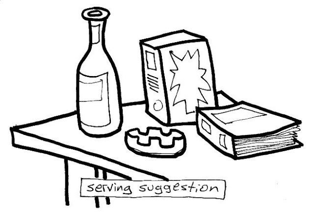
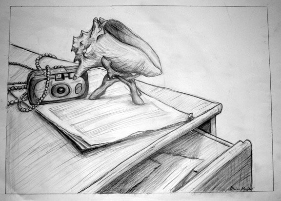
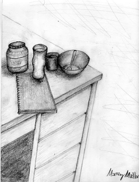
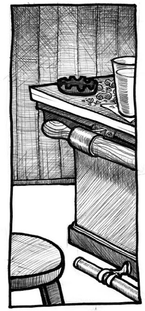
First sketch out four pages/panels of thumbnails (little preparatory roughs in your ever-present sketchbook doodled while sitting in another class, at work, at meals, bar etc.)
• Thumbs due for review in class this Thursday Jan. 29th
On a full sheet of 9x12” regular drawing paper, while sitting at or near a table, draw an assortment of objects/items arranged on a flat surface and show them in perspective.
• Remember to overlap some of the objects, create a convincing illusion of a 3-dimensional scene on a 2-dimensional sheet of paper.
• Draw using a pencil, light lines first until you are sure of the marks you are making,then darken enough to be able to seen at a distance.
• Also give yourself a couple inches of a border for your panel/frame.
• As with all projects done in this class - get up & look at your piece while standing away from it every once in a while.
• Note - Items should reflect something about you & your interests.
• No need to suggest background, emphasize lines, keep it simple with areas of flat tone for shading: just concentrate on clean linework, in pencil.
Put your name on it as we will be taking a look at them in class Tuesday Feb. 3rd
__________________________________________________
 Also, I would point now out that all the assigned work in this class is geared towards accommodating both the students who are terrified of creative expression, and those who are bored shitless with stupid homework. In other words, there are clear-cut parameters and fixed goals to achieve for those that have enough trouble as it is just drawing anything, and simultaneously there is sufficient wiggle room for the more advanced students to play around with the boundaries of each assignment, get weird and have a little fun while still addressing the core concept.
Approximately an hour-and-a-half is left for the remainder of the class – this is an unusually long lecture due in part because of the subject matter and also because I have to take extra time explaining basic matters such as what thumbnails are and the importance of staying on top of when things are due, etc. (assume they know nothing is the best rule of thumb) plus cover all the little details/notes outlined in the assignment handout which will become routine assumption once we hit our stride, for example, remembering to put their names on pieces etc.
Now we usually take a big drawing pad and pencil and scatter throughout the art department, pairing up at the extreme ends of the hallways so as to spend a half-hour each on two sketches of one-point perspective. This involves a bit of running around on my part, and during the first sketch I can pretty much quickly ascertain how much time needs to be spent with each individual student. In the case of more comparatively advanced people, I can shift them to a more challenging view, say a stairwell or a section of hallway with 2-point and/or lots of miscellaneous detail from ducts and equipment in the way up on the second floor. With the folks that might be having a bit of trouble I’ll spend extra time at their elbows giving step-by-step, specific pointers, in some cases explaining the sighting technique with their pencils again.
This is also a key reason studio art class sizes are limited to such a small number, as the logistics of juggling 15-20 individual needs in such a way can quickly eat up a lot of time.
Also, while making the rounds, I’ll use the one-on-one time to take attendance, and make sure that they are absolutely clear on what is expected with the first assignment, and if there are any particular issues or problems they might have with anything else, on the offhand chance they didn’t speak up during the lecture or demonstrations (some people might be intimidated into thinking their questions are stupid).
 Finally, to establish the rhythm that the class sessions will generally follow throughout the rest of the semester, I get them used to a pattern of constant reviews by having everyone meetup back in the room fifteen minutes before the end of class and slap their (best) in-class efforts up on the wall for a quick peek. Spearheading this informal, casual review, I’m usually the only one doing any talking, and I keep it anonymous as far as who’s particular pieces I happen to pick out for comment. A major point is brought up that being in a classroom environment we have the benefit a collective experience in being able to see what others are doing and how. Lots of potential light-bulb/”a-HA” moments when you can point to another piece up on the wall and suggest borrowing/stealing another, more successful solution to any problems they might have has on the same subject matter.
Plus, like a 12-step meeting, they learn the definition of humility; you’re not as good as you think you are and you’re not as bad as you think you are, i.e. there’s always someone else doing better or worse than you. I caution that constant comparison and measuring of one’s work against other’s has only limited value though; it is far more important to worry about reaching enough of a personal understanding and have it reflected in your own work, learning about one’s own liabilities and strengths instead of worrying about someone else’s and how much better or worse their work might look (later on I’ll devote some class time to talk about individual “style” and how it relates to art).
At last, I send ‘em all home with a seed by planting a “wearing glasses” metaphor: a reminder for observing underlying shapes and linking the concept of one-point linear perspective with the real-world experience of driving home: I tell them to take a local expressway and find, then follow the vanishing point on a horizon line (in case they get pulled over they can always blame it on me). Every time we jump into another concept I like to think of it as handing them all a new set of prescription glasses that they will then go about viewing the world with a different focus on new features. So that after today they’ll hopefully start seeing examples of linear perspective everywhere. Something like that.
“Effective as perspective is... it becomes a deadening influence on an artist's natural way of seeing things once it is accepted as a system – as a mechanical formula.” - Graham Collier

No comments:
Post a Comment