Friday, January 30, 2009

"Guys Read"


Today I filled in as a backup pinch-hitter for the “Guys Read” program, which is a volunteer program jointly developed by Fairbanks North Star Borough Libraries in partnership with the Borough School District and the Literacy Council of Alaska (and funded by the local Toyota dealership). They get random men from the community to go into public schools and read selections from popular books to groups of 4th grade boys over their lunch period, serving as role models to encourage reading and to help promote literacy. Besides showing that reading is fun, it also helps to break the prevailing stereotypes that it isn’t cool to read and that guys shouldn’t ever be caught dead with a book. I recall during the initial training from the first year (it’s been three now that the program has been up & running) an appalling statistic that the adult male in America now reads an average of one book a year. That’s a stunningly pathetic figure, and maybe goes a long way towards explaining some of America’s current sad state of affairs. The theory here is that young boys never have the benefit of ever actually seeing other males engaged in or enjoying the simple act of reading for pleasure; partially from social peer pressure to not appear geeky (as it is way more cool to be a stupid lout), plus the feedback cycle of being brought up in households where nobody has the time to enjoy a good book.
This stands in stark contrast with my own upbringing; raised an only child by a librarian mother and bookstore-owner dad I remember always being surrounded by books, and they were my constant companions rather than relatives or friends. Every room in our apartments were crammed with ceiling-to-floor bookcases, stacks and stacks everywhere – I was probably prouder as a young teen to reach a thousand sci-fi & fantasy paperbacks in my personal collection than I was losing my virginity. Before that I had spent years as a mall-rat either playing pinball or sitting and reading in the aisles of the bookstore my father managed.
In fact, one of the funnier recent conflicts between my girlfriend and myself was the discovery that in her Midwestern family farm, dinner was a time for family, and it would have been considered rude to bring a book to the table – the opposite in my past, as I recall the three of us sitting around our table each with a book. This would be one reason I still manage to read in my outhouse even at forty-below, old habit die hard.

Some of the influential authors and titles I read over and over again as a youngster, and still have on a shelf in my cabin today: works by C.S. Lewis (“Narnia”), A.A. Milne (“Winnie the Pooh”), Antoine de Saint Exupery (“The Little Prince”), J.R.R. Tolkien (I still re-read “The Silmarillion” annually), Maurice Sendak, William Steig (“Amos & Boris” in particular), Lloyd Alexander (“The Chronicles of Prydain”), Ursula Le Guin (“Earthsea” novels), obsessive collecting of Micheal Moorcock, and endless fairy tales and mythology throughout.

So I really have no experience or understanding with matters of illiteracy; to this day I'm usually in the middle of sometimes a dozen titles weekly, and am a regular patron of both (divided loyalties stemming from childhood I suppose) the local independent bookstore along with monthly expeditions to the university and public libraries.
But now the greatest confluence of events occurred when the social stigma of comic books and cartoons ended, and the genre was afforded new respect and legitimacy (grudgingly in some cases) in the dual realms of literature and art: most educators now belatedly realize that comics might just be the last, best chance they ever have to entice young boys & girls into developing life-long habits of reading.
This is the key angle I’m currently pursuing as a new member on the Literacy Council of Alaska’s board of directors, along with volunteer efforts such a the Guys Read gig: the popularity and acceptance of comics and graphic novels today presents a unique opportunity to really promote literacy in the classroom. In addition to reading, there is also a case to be made for the comparatively worse state of affairs as far as “visual literacy” goes – kids these days rarely get to see an artist create work right in front of them, which cartooning is a particularly effective medium to demonstrate in public settings. Nothing provokes the “room full of monkeys” better than when I start doodling up on the board, and despite my ingrown, reclusive instincts I always wind up having a wonderful time.
*Incindentally, the book we read in class today was Dav Pilkey's "Captian Underpants"

And the sweetest irony of all is that I’m actually a high-school dropout who used to flunk art classes because all I wanted to do was draw comics – a point that isn’t lost on me every year when I do show & tells around the district; talk about everything coming full-circle... >neener-neener< Mrs. Braen!

Thursday, January 29, 2009

Multi-point Perspective


“Fuck it, Dude, let's go bowling.” - Walter Sobchak

First we grab our pads of newsprint paper & pencils and run over the parking lot across to the Wood Center, where I’ve reserved us the bowling alley. There for the first hour we’ll bang out a warm-up sketch utilizing one-point linear perspective as the basis for the drawing. As an added bonus I get a chance to subject them to the soundtrack for the Big Lebowski, which is a real treat at 8am, not to mention the disco mirror ball and blacklights are an inspiration too. Sure enough, maybe 90% of the initial efforts were way off, and a restart was required after some reminders on basic observational skills.
I didn’t think it was too good of an idea last semester when I took advantage of my classroom being situated right next to a railroad track for an intimate, first-hand experience of what 1-point perspective really looks like; probably the Department of Occupational Safety & Hazards would’ve had a shit-fit if they saw it. So a close second is getting their minds in the gutter instead – a textbook example of line convergence in action.

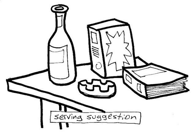
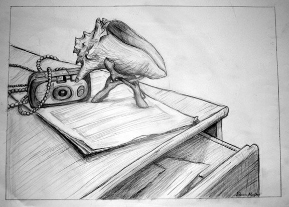
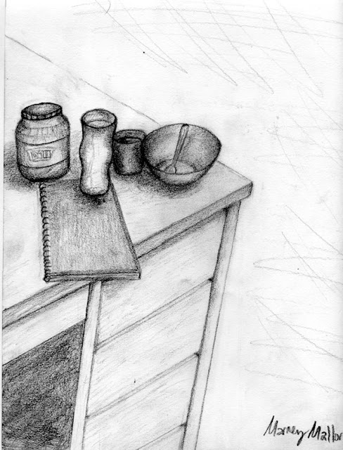
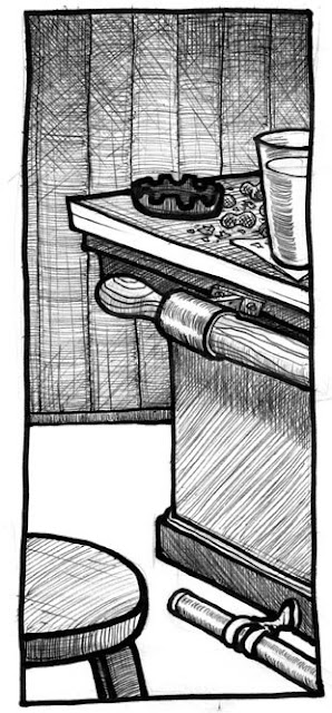
Then it’s back to the studio where earlier in the morning I’d assembled a dynamic still-life epitomizing the human condition. Just kidding, there’s a pile of planes (assorted boxes & boards + few scattered spherical objects & bottles) up on the center table. Not having the old stash of stuff to, er, draw from, I improvised with a raid on the janitor closet that yielded many rolls of toilet paper & paper towels. The goal of the exercise is to have the objects correctly drawn as being on the surface of the table, as opposed to wonky or looking like their perspective is drawn from someone whose head is somewhere up on the ceiling. As with most in-class exercises this is geared towards helping with their first assignment, and eventually the first critique, which is also handed out and explained today:
________________________________________________________
First critique: Interior Space
On a sheet of good drawing paper, using a border, in pencil:
Draw the interior of a room; any space that you inhabit, that has some particular use or value to you. Include two corners, ceiling & floor.
Also include some indication of personality through some telling objects of interest, or reflect your general state of affairs (ex: neat & tidy, a slob? Books? Cooking? Signs of children or pets? etc.)
• Concentrate on linear perspective, emphasize the lines,
• Don’t forget about using sighting device & internal reference points.
• Frequently re-check your angles – draw only what you see: create a believable illusion of depth.
DUE IN CLASS TUESDAY Feb. 10th
*4 pages/panels of thumbnails of different sample perspectives are due in class Tuesday, Feb. 3rd


This still-life serves the additional purpose of having me show them how to utilize internal reference points for gauging relative positioning and accurate observation. The pencil as a measuring device comes back into play, along with a secret weapon used as a last-ditch teaching aide: a small piece of plexiglass + dry-erase marker. With the worst-case scenarios I’ll resort to holding this plane up in front of their faces and making them trace the outlines of the still-life, then bring the plexy down onto their paper. 99% of the time this is the clincher for the final holdouts on putting it all into proper perspective.

Depending on the overall progress of the class now I’ll either accelerate the schedule and jump into more challenging environments, or torture them with a couple extra days playing with blocks. For the handful of people that might be bored or way ahead of everyone else, I have them use the still-life a reference model and create a cityscape being destroyed by an alien monster. This class seems ok enough to merit the dropping of a couple days worth of basics, so next week we’ll step it up

Note: The MFA student’s show opens tonight also, which I strongly recommend folks in my class to attend. It gives them a chance to hone a few important skills in being a serious fine artist; mooching food, schmoozing, and gossiping about other artists after the reception. Actually, it’s mandatory for my students to attend a least one art opening over the course of the semester (more on our community’s “First Fridays” at a later post).
But during our class’ break today we’ll pop in the gallery to preview the works and have an informal reaction to individual pieces and the caliber of the overall show. I also take a minute to explain what the differences are between a B.A with an art major or minor, the B.F.A. program, which is roughly another year of upper-level studio-intensive courses that allows both a major and a minor in art (ex: majoring in painting with a minor in sculpture) under the guidance of a thesis committee and topped off by a two-week thesis exhibit, and lastly the M.F.A. graduate level of study.

"Yeah, well, you know, that's just, like, your opinion, man." - The Dude

Wednesday, January 28, 2009

Balancing Act

“Human salvation lies in the hands of the creatively maladjusted.” - Martin Luther King Jr.

One “meta-lesson” I picked up on while earning a BFA was gained from observing the art teachers who I respected the most. I wondered how on earth they managed to teach a full load of classes, deal with herds of students every day, every week, each with a seemingly inexhaustible laundry-list of issues, serve on various committees with the unceasing flood of paperwork associated with any bureaucratic administration – and THEN somehow maintain a status-quo existence as contributing members of society and the demands of family. But wait – then there’s also that part about being an artist.
*As a side-note here, this haggard juggling pales in comparison to whom I view as many of the hardest working people in the trenches around here; grade-school art teachers. Whenever I visit local high-schools I’m always constantly in awe of the sheer logistical task set before these artists – herding creative cats amidst that particular environment and again, all the while maintaining their own respective bodies of work is intimidating to say the least. And in this district we truly have some of the most talented teachers and artists I’ve ever seen.
Meanwhile, back to my college years; I started learning from my own teachers by example; seeing them lead “normal”, healthy & balanced lives: running households, maybe being married, raising kids, paying bills, making meetings, working side-jobs, and somehow still managing to crank out prodigious amounts of amazing high-quality art on top of it all. While I didn’t necessarily aspire be them, as in live their lives or do their art, it called into question some long-held assumptions about what it meant to be an artist. The stereotype of an angst-ridden, antisocial and irresponsible doesn’t really do artist any favors, even if it might serve to excuse away some of the more colorful and traditional excesses of the lifestyle. There might be some gross characterizations of creative qualities, from immaturity, disorders ranging from emotional instability to outright insanity, but along with obsessive self-centeredness, these all pretty much describe a fair share of the average driver I see on the road into town each day.
Personality traits of the most successful in my circle of acquaintances tend to be maturity and discipline, along with a sense of curiosity and maybe a touch of irreverence or at the least, open-mindedness (some notable exceptions aside). As far as the psychotherapy goes, being prone to depression might have equal origins in nature; seasonal affective disorder in a tiny little cabin, and nurture; growing up an artist. I’ve spent much time mulling over the merits of art either instigating or inhibiting such tendencies, and will probably return to this thread at a later point, as it can be quite the can of worms to play with.

So a good portion of my income is derived from miscellaneous freelance gigs, and I’ve mentioned how having one foot in the fine art world and the other in commercial art (take a guess what’s happening to the cartoons) gives me an interesting take - speaking of perspective - in the classroom.
Thus, when I happen to show up in the morning unshaven, stinky & baggy-eyed from staying up way too late working on deadlined projects, I damn sure don’t have much tolerance for any lame excuses about why homework isn’t ready for review. So much for the refreshing, no-bullshit real-world experience, or, as I tell students, I’ll personify the subtle distinction between “sympathy” vs. “empathy” for someone else in such a situation. It’s almost required to teach time-management skills in the classroom, and is what’s behind the intermediary thumbnailing stages & compositional roughs before each piece. Setting aside the time to devote to your work has to be one of the key lessons, even conceptualizing takes time (at least that’s what I tell my girlfriend when she finds me on the couch). If there’s one thing that I parcel out for advice these days when asked about how to be an artists, it’s simply getting up early. Gone are the days of pulling all-nighters for this dude.
This dovetails with another phrase I’ve adopted over the years; “clock in and be creative” which reflects my time spent as a graphic artist. Some artists react to such a mantra as a sort of anathema to the muse, but I’ve come to rely on that mindset as a primary motivation to producing work. Sitting down at the drawing table regardless of my mood and learning to work past, over or through personal situations can be as much of an asset as finding creative solutions to problems either on the paper and/or in your head. One could argue it serves as a bulwark against the many stresses and distractions you’d otherwise get caught up in, some sort of a respite or shelter from the storm, or maybe it’s just a form of denial?
Case in point being right before this class started I got several new gigs in quick succession: two tshirt/poster logos for events happening in the summer and a wedding invitation. Add those to the backlog of editorial panels, weekly cartoons and some private projects, the weekend just got scratched off my schedule. So what am I doing blogging? It’s a welcome diversion - now over to my Facebook page.
(… one hour later …)
Seriously though, I’ll settle into pacing my posting on alternate days from here on out, shorter blurbs too. May have noticed Ink & Snow is revamped with pix now along with some selected samples of student work in sync with the current topic of attention. Huh, art on an art blog, what a concept.

“Why do people think artists are special? It's just another job.” - Andy Warhol

Tuesday, January 27, 2009

Perspective (day one)


"I see drawings and pictures in the poorest of huts and the dirtiest of corners." - Vincent van Gogh

Showed up this morning a good hour-and-a-half early to set up the room: using a shared facility means sometimes easels have to be broken down and put away + the drawing tables brought out, copies made, notes reviewed, and if necessary, still-life setup, plus firing up the laptop & projector, loading up images etc. Getting up at 5am after six hours of sleep usually entails some motivation in the forms of music and lots of caffeine. I find Beethoven’s Symphony #6 (“Pastorale”) to be particularly appropriate, and in the classroom, students are greeted with some funky zydeco (in this case a “best-of” live sampler from 2008 Donna the Buffalo shows). Always need a good soundtrack in my opinion… couple weeks ago it went from fifty-below zero to fifty-above, then back down to a stabilized “normal” of around zero (10 above/10 below range); now it is forecasted forty-below again by Thursday’s class – so taken with the darkness it can be a monumental challenge just to get out of bed for some folks, much less get psyched up about an 8am class…

As it turned out, already deviated from the schedule by having the class practice 1-point linear perspective in the library instead of the department hallways. Due to the code-corrections for the art building there’s a little bit of overlap with completion, and with the ensuing confusion it was saner to migrate up to some handy bookshelves on the top floor of the UAF Rasmuson library (right by the art books conveniently enough).
So after the lead-in lecture, blackboard demos and handout of first assignment + half-hour show & tell of images and previous student’s work, we trooped off to stake out positions around the book stacks. Technically threw them off the deep end as this was 2-point linear perspective, but overall the majority of students got a grip and did a decent job.
I can also now roughly gauge at this point where the class as a whole seems to be, and this group is average; a few excelling, a few lagging, most getting the job done (creating a convincing illusion of depth). Probably made about four rounds total with everybody individually; making mid-flight course corrections where needed, or offering words of encouragement, sometimes getting right in there with them and (with permission) making adjustments directly on their sketches, maybe even recommending a restart (after another mini-demo) on where exactly they are going wrong (and right). More often not this is the place things start to make better sense as far as exactly what the hell is going on; rubbing elbows works with folks i.e. doing it right there in front of them is vastly more effective for some than the eye-glazing 8am speech in a dark room.
After an hour or so, back to the studio to slap everything up on the wall for a real quick overview, revisiting a few key points by commenting on a handful of specific examples. And then that’s it for today, aside from the homework. After the class it’s signing paperwork, errands on campus, picking up a key, dropping artwork off to be framed, meeting a client, then back to the ol’ drawing board!

Also this morning the general pace of the class was established; a brief lecture, a demo, go draw stuff for practice, brief review/recap. Another subtle distinction here with my particular approach is the speed at which I put them through their paces; I’m a big fan of giving up and moving on – in other words, if things aren’t quite coming together, starting again. I’d much rather prefer to see them invest more time on the assignments & critique pieces, and focus most of classroom time doing warm-ups and dry runs – these aren’t masterpieces we’re striving for but experimentations with the concepts to be put into practice afterwards with the homework.

“If you can't draw something, just draw it.” - Dieter Rot

Monday, January 26, 2009

Pre-Perspective II

“Perspective is a ghastly mistake which it has taken four centuries to redress.” – Georges Braque

For tomorrow’s opening yak I’ll formally introduce perspective, focusing on linear (using only lines) and atmospheric, and the concept of foreshortening: objects getting bigger as they come closer to the viewer, smaller as they recede in the distance + overlapping as another visual indicator of depth. Again, this’ll be a classical, academic approach to acquiring crucial skills in drawing – the seeing (drawing what you see v.s what you think you see), using observation to understanding what you are seeing (reducing elements to simple underlying geometric shapes and angles), and how to reproduce it through the illusion of 3d space on a 2d object (the paper).
Starting with typical Egyptian figures as a historical example of what depictions looks like without perspective, we’ll compare and contrast this against the Renaissance overhaul, and later, the influence of cubism (this will also conclude my patented 5-minute Slam History of Art overview). I finish with an assortment of contemporary images that showcase perspective including comic book art - Spiderman and Batman in their respective cities are the best - and some spiffy sidewalk art using optical illusions.

I’ll cover the topics of comprehending and establishing a horizon line, planes, and what points of view relative to bird’s-eye & worm’s-eye look like and how to achieve them, what vanishing points mean, and one-point, two-point and multi-point linear perspective. Another great aide for this is utilizing the view out of the studio window to trace neighboring campus buildings with a dry-erase marker and projecting the appropriate lines for them to see. Plus a few demo sketches are done up on the board of a variety of objects such as my truck and outhouse, and then a rough sketch of the actual drawing studio that we are sitting in.

That gives an opportunity to describe the step-by-step process of deleting extraneous details cluttering up the view, and to first begin roughing in the biggest, simplest underlying shapes or planes. I equate it with constructing a stage (assembling props, etc.) or better yet, building a house: you need to hang a door first before putting in the doorknob (duh), and put up a wall before that. It is akin to a common mistake many beginners do when drawing a figure; becoming fixated on the texture of hair for example before the underlying head shape is in place, or detailed eyelashes before there is a face established. Not to mention the all-too mistake of the “running out of room on the paper’ syndrome – an added benefit behind stressing the “sketching” aspect of drawing: light, loose lines gradually becoming darker and more definite when you become surer of their proper places.
This fluid approach means deprogramming many students of the tendency to grip the pencil so hard it embosses the paper, to instead use some finesse, and also to keep it in motion, moving around the paper and not getting hung up on a particular area before establishing all the relative, contextual information first. Also at this point I will also show the use of their pencils as an invaluable sighting and measuring device to use while sketching their first in-class exercises.

Before we begin, the first assignment is handed out and gone over, buttressed again with samples of previous student work, discussing their relative shortcomings and successful solutions:

__________________________________________________

ASSIGNMENT ONE: TABLETOP
First sketch out four pages/panels of thumbnails (little preparatory roughs in your ever-present sketchbook doodled while sitting in another class, at work, at meals, bar etc.)
• Thumbs due for review in class this Thursday Jan. 29th
On a full sheet of 9x12” regular drawing paper, while sitting at or near a table, draw an assortment of objects/items arranged on a flat surface and show them in perspective.
• Remember to overlap some of the objects, create a convincing illusion of a 3-dimensional scene on a 2-dimensional sheet of paper.
• Draw using a pencil, light lines first until you are sure of the marks you are making,then darken enough to be able to seen at a distance.
• Also give yourself a couple inches of a border for your panel/frame.
• As with all projects done in this class - get up & look at your piece while standing away from it every once in a while.
• Note - Items should reflect something about you & your interests.
• No need to suggest background, emphasize lines, keep it simple with areas of flat tone for shading: just concentrate on clean linework, in pencil.
Put your name on it as we will be taking a look at them in class Tuesday Feb. 3rd

__________________________________________________

Also, I would point now out that all the assigned work in this class is geared towards accommodating both the students who are terrified of creative expression, and those who are bored shitless with stupid homework. In other words, there are clear-cut parameters and fixed goals to achieve for those that have enough trouble as it is just drawing anything, and simultaneously there is sufficient wiggle room for the more advanced students to play around with the boundaries of each assignment, get weird and have a little fun while still addressing the core concept.
Approximately an hour-and-a-half is left for the remainder of the class – this is an unusually long lecture due in part because of the subject matter and also because I have to take extra time explaining basic matters such as what thumbnails are and the importance of staying on top of when things are due, etc. (assume they know nothing is the best rule of thumb) plus cover all the little details/notes outlined in the assignment handout which will become routine assumption once we hit our stride, for example, remembering to put their names on pieces etc.
Now we usually take a big drawing pad and pencil and scatter throughout the art department, pairing up at the extreme ends of the hallways so as to spend a half-hour each on two sketches of one-point perspective. This involves a bit of running around on my part, and during the first sketch I can pretty much quickly ascertain how much time needs to be spent with each individual student. In the case of more comparatively advanced people, I can shift them to a more challenging view, say a stairwell or a section of hallway with 2-point and/or lots of miscellaneous detail from ducts and equipment in the way up on the second floor. With the folks that might be having a bit of trouble I’ll spend extra time at their elbows giving step-by-step, specific pointers, in some cases explaining the sighting technique with their pencils again.
This is also a key reason studio art class sizes are limited to such a small number, as the logistics of juggling 15-20 individual needs in such a way can quickly eat up a lot of time.

Also, while making the rounds, I’ll use the one-on-one time to take attendance, and make sure that they are absolutely clear on what is expected with the first assignment, and if there are any particular issues or problems they might have with anything else, on the offhand chance they didn’t speak up during the lecture or demonstrations (some people might be intimidated into thinking their questions are stupid).

Finally, to establish the rhythm that the class sessions will generally follow throughout the rest of the semester, I get them used to a pattern of constant reviews by having everyone meetup back in the room fifteen minutes before the end of class and slap their (best) in-class efforts up on the wall for a quick peek. Spearheading this informal, casual review, I’m usually the only one doing any talking, and I keep it anonymous as far as who’s particular pieces I happen to pick out for comment. A major point is brought up that being in a classroom environment we have the benefit a collective experience in being able to see what others are doing and how. Lots of potential light-bulb/”a-HA” moments when you can point to another piece up on the wall and suggest borrowing/stealing another, more successful solution to any problems they might have has on the same subject matter.
Plus, like a 12-step meeting, they learn the definition of humility; you’re not as good as you think you are and you’re not as bad as you think you are, i.e. there’s always someone else doing better or worse than you. I caution that constant comparison and measuring of one’s work against other’s has only limited value though; it is far more important to worry about reaching enough of a personal understanding and have it reflected in your own work, learning about one’s own liabilities and strengths instead of worrying about someone else’s and how much better or worse their work might look (later on I’ll devote some class time to talk about individual “style” and how it relates to art).

At last, I send ‘em all home with a seed by planting a “wearing glasses” metaphor: a reminder for observing underlying shapes and linking the concept of one-point linear perspective with the real-world experience of driving home: I tell them to take a local expressway and find, then follow the vanishing point on a horizon line (in case they get pulled over they can always blame it on me). Every time we jump into another concept I like to think of it as handing them all a new set of prescription glasses that they will then go about viewing the world with a different focus on new features. So that after today they’ll hopefully start seeing examples of linear perspective everywhere. Something like that.

“Effective as perspective is... it becomes a deadening influence on an artist's natural way of seeing things once it is accepted as a system – as a mechanical formula.” - Graham Collier

Sunday, January 25, 2009

Pre-Perspective

“If you intend to make a living at drawing, by all means learn it [the rules of perspective] now, and do not have them bothering you and your work for the rest of your life.” - Andrew Loomis

This is generally the hardest part of any given class for beginners (with the possible exception of figure drawing), but I personally like to kick-start the semester with it. Besides weeding out a couple slackers who quickly figure out that there’ll be a lot of work expected out of them, it can really gives folks who might not be all that confident in their initial skills some positive reinforcement right out of the gate.

I always like to share an important and humbling lesson learned from one young woman from a few years ago who just Could. Not. Get. It. Nomatter how long I spent one-on-one with her before, during, and after class, and despite every trick of the trade I had at my disposal; it was like she lived in a completely alien dimension. Usually I maintain all that an individual needs is the basic motor skills to hold a drawing utensil and enough cognitive ability for spatial depth perception. But there’s always a couple every year that it just seems to be fundamentally beyond them, and this woman was close to losing it over her inability to understand perspective. As it turned out, of all the students in that particular class, her work became the most interesting once she found her strength lay instead in non-linear forms, especially with value. It's important, but not critical - doesn't mean you can't draw or be an artist, as there are lots of techniques to compensate for shortcomings as in everything else with Life.
So in that way, it’s not too much different than a stupid Rubic’s cube; each week another side is explored, another medium is experimented with, and various topics rearranged in relation to each other; sometimes it seems as soon as one “rule” is established it goes out the window in the very next class. Or put another way, it’s like each student is being rock-skipped across the vast, deep body of art, and I just try to give enough velocity and momentum to reach their respective interests and abilities before sinking (usually around the end of the semester during finals week).

I also preface discussion on this topic by recalling pretty much everyone’s experience - usually around middle school - there’s always some schmuck in the class who gets tagged as “the artist”, usually because they’re the ones who can draw really cool looking spaceships or dinosaurs, or slavishly copy whatever’s the currently popular game or comic-book character. Somewhere along there we pick up on the default equivalence of a drawing having to “look real” in order for it to be judged as “good”. And a lot of folks at that point just give up, tell themselves that they suck at art and leave it to the ones who obviously possess some innate talent. So by the time they show up in this class many years later there’s an awful lot of accumulated personal baggage to unload about what they can or cannot do and all the consequent frustrations and fears.

By contrast it can be a pure joy to sit in with younger children while they’re drawing; they just go at it without any preconceived notions hanging over their heads about how good it is, just uninhibited expression. You tell them to draw X, and they just have at it with abandon, and at times, a concentration that I wish I could sustain. In my own work I am forever lapping waves against this gradually crumbling wall of artifice, and often am jealous of simpler, unguarded efforts of peers with their unrefined and at times more honest and immediate pieces. So I share in the trepidations of students who worry at the reception of their work, as it is a lingering tension for many artists, including myself. Part of what I hope this class gives them is a series of experiences that will in effect help them to become somewhat inured of such doubts while balancing the relative merits of objective criticism against their own feelings and motivations for doing art.

But back to the prevailing realism that constitutes most people’s definition of what makes a picture “good”. I think that having a student achieve satisfactory results on what previously seemed an impossible task and is for many the foundation of drawing is a positive reassurance that they’ll succeed. Here again I offer myself up as a prime example of all that one really needs to do to get the job done: within the panel borders of most cartoons is a picture plane wherein elements are arranged in such a way so as to convey that illusion of depth. By compositionally placing objects in the foreground, mid-ground and background, by overlapping them, and using foreshortening, plus understanding the basic ideas of linear perspective, a 2-dimensional drawing - a simple bunch of marks on a sheet of paper – becomes a portal, a believable window into another world, a fully realized 3-dimensional space. From hereon out we’ll populate it with the stuff of imagination, but for now, creating that convincing illusion of depth is crucial. Now, after they see me scribble out a pickup truck, an outhouse, or similar object on the board, they’ll quickly figure out that I ain’t exactly a stickler for the finer points. – if perfection is their goal then through the aid of powerful computers they can ultimately achieve their vision. Or, if the faithful copying of reality is paramount, I suggest just buying a cheap digital camera and saving oneself considerable time, expense and frustration. Again, I’ve found that the simple cartoon is a handy and unassuming way to present the underlying principles without being an overwhelmingly technical and theoretical deluge of information. I do lecture at length about the theory, because it’s rather fun in a geeky sort of way, but it’s more a matter of what sticks afterwards, and what shows up in their own works.

To that end, as with all sessions where a new topic is introduced, I will lecture and demonstrate on the board along with paper on easel in the front of the classroom, and then project a series of images that literally illustrate what I’ve just been babbling about for a half-hour or so - in effect reinforcing particular terms by repeating them again in conjunction with specific examples of previous student’s works. I err on the side of inspiring them with these examples, as most appreciate the chance to see concrete and successful solutions from other beginners – some instructors maintain this could have the reverse result and instead intimidate them, and/or essentially “give the answer away”, but to date I haven’t seen an instance of that happening. This also affords the opportunity for an informal dry run on critiquing, as we go over what works, what doesn’t, and why on each piece. Casual discussions like this provide insight on what they will be doing over their own works and that of other classmates within the upcoming weeks. I also urge them to take a second and maybe sketch out a few of the offered examples during the show & tell. Then its on to a battery of exercises…

“I remember Francis Bacon would say that he felt he was giving art what he thought it previously lacked. With me, it's what Yeats called the fascination with what's difficult. I'm only trying to do what I can't do.” - Lucian Freud

Saturday, January 24, 2009

First Day Postscript II

“Art is making something out of nothing and selling it..” - Frank Zappa

A few more add-ons here about the opening lecture.
During the show & tell, I discuss how for many folks, if not most, their definition of “Fine Art” usually implies something framed and hanging in an expensive gallery. That’s cool - I do that, and if that’s their trajectory or goal, I’ll back them up and show how it’s done. But there is an annoying little statistic I’ve observed over many years in that the vast, overwhelming majority of folks in this community (and most others unfortunately) never ever set foot in a gallery. And furthermore, of those that do, the overwhelming majority never actually buy anything. So if that’s your definition of success in the arts, lotsa luck. Chances are, you will reach far more people and have a more lasting, intimate connection by doing your own damned xmas cards every year, or a tshirt or etc. Kinda white-trashy/low-fi approach, but puts it within reach of most beginners and is a palatable enticement into doing art, like a gateway drug into creative expression I guess.

This dovetails with an epiphany I had several years ago: I had a piece in a juried exhibition at a gallery, and after attending the opening reception, went across the street to a popular bar where some friends were performing. I had set up a table there next to the stage to sell signed posters I had done for the band, along next to another table full of tshirts also sporting my designs, and their logo that I had designed had been newly screened onto the bass drum, plus a couple of the guys were also wearing it on their tshirts, along with a few other people in the crowd. I realized then that it was a perfect case in point of having one foot in both worlds: art on display in a dark, locked space that not too many people will ever see vs literally alive in an environment where it was thumping, sweating and dancing around.

This leads me to a second point, in that I have a pretty simple, functional working definition of my own when asked about “what is art?” – I usually clarify by way of an answer: visual art? If so, then simply put, it should be seen. Hence my experience and strongly influence from time in the trenches as an illustrator, both with a professional studio and solo freelance gigs. That’s why I absolutely love promoting the usage of images everywhere and on anything – tshirts, logos, ads, cd covers, posters, mugs, fliers, greeting cards, websites, magazines, newspapers, etc. etc. hell, you name, it I think it should have your art on it. So I really don’t fret much over any arbitrary and stuck-up distinctions between “fine” art and “commercial” art, it’s all good. Most of my close acquaintances can’t afford to buy art anyways; the closest they can get is the exhibition card – I can’t count how many refrigerators and outhouses I’ve seen that are mini-galleries. So I’m also a big fan of staggering items in terms of affordability at shows: cheap digital prints done at a local Xerox shop, slightly higher-priced archival giclee prints for the discriminating consumer, and for die-hard fans the expensive originals are all available for purchase. All this pretty much buttresses one of the pivotal aspects of the whole postmodernism movement; the erasing of boundaries between high and low art or culture. This in turn creates some cognitive dissonance later in the class, when I seem to abandon the strict, linear acquisition of skills geared towards creating traditional, classical works concerned with the more formal elements in drawing and start emphasizing and playing around instead with content, intent and application or usage of student’s images. Sending out mixed messages works about as well in parenting, but it sure can be fun as hell.

So, as mentioned above, while recognizing that striving to create works of “fine” art to be selected, displayed and purchased in a gallery is often the be-all/end-all holy grail of most artists, and again, while understanding and participating in the gallery scene myself, I will support & encourage students who wish to follow that path. But there’s some value in also recognizing that that particular approach of traditionally defining the function and role of an artist and their work can severely limit it as well, and even inhibit the . The customary gallery model is following the same path as the recording industry, and will ultimately suffer the same fate - failing, but still serving an important purpose within the overall scheme of things in the art world and within creative communities. In the meantime, promoting a viable and profitable presence, and maintaining a healthy balanced “art-diet” wherein an artist is well-rounded enough to participate in multiple mediums, venues and creative outlets is a topic I will return to here on this blog, as I incessantly harp upon it in class.

“Making money is art and working is art and good business is the best art.” -Andy Warhol

Friday, January 23, 2009

First Day Postscript

Just like always being somewhat unsatisfied with my own art and forever starting all over again on another piece, I usually space out saying something important during the first lecture. One reason why I’m glad there’s a whole semester; whenever I go home and kick myself for not mentioning some point or another, there’s always the next class to recap and expand upon any given topic. I suppose the constant experience of giving talks and presentations around town to different groups has a side-benefit of training me to focus better and consolidate the crucial information – but that always goes neck & neck with the exponential accumulation of new ideas and examples. In this way I cringe whenever looking back in retrospect at what my first classes were like - just like looking at my own artwork from years ago. Long as both keep getting better and there’s no stagnation that's cool.

Tucked in amidst the initial set of handouts I now throw in the “General Guidelines" pasted in below. Don’t have any idea where it originated from, but as an unofficial template for assessing students it for the most part falls into line with my own approach for grading. As of the past couple years, the average spread of grades in my classes usually are 3-5 “F’s” out of 20 students, a few “A’s”. couple “B’s”, bunch of “C’s” and maybe a “D” or two. The majority of failures are always a direct result of attendance issues – while I’m a little more lenient compared with other faculty with a policy that allows for a couple missed classes, the hammer falls pretty hard after that. Given the situation of living here, I strongly recommend to not miss any classes, keeping in reserve the “get out of class free” cards as there will undoubtedly be some extenuating circumstances at some point. For example, in the past few weeks we went from sixty degrees below zero to sixty above and now back to the “normal” ten-above to ten-below. Shit happens, vehicles die, the cold and darkness starts to weigh and sleeping in for an 8am class becomes a siren song. I can't teach them if they aren't there, and I make the point that it is basiaclly a job in that if they don't show up, they don't get paid, and eventually get fired. Falling behind in a studio art class is a guaranteed nightmare of a slow death, as most people initially underestimate the sheer volume of work that can swiftly accumulate and overwhelm. Especially since the invested time factor for each project is pretty evident – the works that were banged out the night before they are due for review in class stick out like a sore thumb on the critique wall. Another reason for my deliberate pacing of assignments and constant monitoring of progress through sketchbook reviews and specific deadlines for thumbnails and roughs well in advance of the respective project’s due date. Again, this allows for gauging the relative seriousness and dedication of each individual student so as to stay on top of potential trouble before it gets out of hand.

"Some General Grading Guidelines for Art Classes"

“A” Student:
• Has clearly mastered technical ability with the material
and joins ideas with that ability
• Displays commitment to the challenges of their work,
goes beyond expectations,
has discipline and self-motivation
• Has a certain amount natural ability or insight, organizational skills and talent
• Comes to class on time and is always prepared
• Is very active verbally, participating well in critiques
• Has almost perfect attendance
“B” Student:
• Has consistent, even results on projects and understanding of material
• Displays commitment to their work and some self-motivation
but will need an outside stimulus
• Shows a certain amount of talent, but hasn’t really developed it yet
• Comes prepared to class at all times or at least most of the time
• Completes work on time
• Is active in discussion and critiques
• Good attendance, missing less than 3 times
“C” Student:
• Obtains inconsistent results, has general idea about what is being addressed but has trouble putting it together, hasn’t mastered the material or what it can do
• Has average commitment and dedication, gets the job done but typically needs
a lot of outside stimulation
• May have an average amount of talent or be lacking in it; or a lot of talent but
poor attitude/cannot organize themselves; or well organized but lack innovation
• Comes to class prepared most of the time
• Completes work on time
• Is active in discussions once in a while
• Good attendance, missing only a few classes
“D” Student:
• Poor or very spotty results on projects, has little understanding of materials
and concepts discussed
• Shows only occasional interest or dedication to projects, poor self-motivation
• Lacks some exceptional skill or talent
• Comes prepared to class only sometimes /about half the time, has trouble or
excuses for completing work on deadline or doesn’t know when it is due
• Poor verbal ability in discussions and critiques
• Poor attendance
“F” Student
• Little or few results on projects; either incomplete or hastily done
• Displays inconsistent results or little commitment to work or ideas
• Almost never prepared for class
• Almost never completes work on time
• Almost never contributes to discussions
• Poor attendance

I have to remain cognizant that a good portion of any beginning drawing class is full of students looking to simply acquire elective humanities credits in the College of Liberal Arts, as opposed to pursuing a career in the Fine Arts. I joke about them at the very least becoming endowed with the ability to attend future art openings and talk the talk with the best of ‘em (even if they can’t walk the walk) after they are done with this class, plus be able to make firm decisions on aesthetic choices while buying art for their own living rooms later on in life (besides matching the upholstery). But developing an informed opinion is a tremendous side-benefit here, and is the underlying function behind learning to critique.

But there is usually a couple every semester that declare an art major, a couple more elect to pursue an art minor, and everyone leaves empowered to some degree that they can draw. Which is good.

“The artist is not a different kind of person, but every person is a different kind of artist” – Eric Gill

Thursday, January 22, 2009

First Day


“When my daughter was about seven years old, she asked me one day what I did at work. I told her I worked at the college – that my job was to teach people how to draw. She stared back at me, incredulous, and said, "You mean they forget?" - Howard Ikemoto

Good start this morning as all seventeen students enrolled actually showed up. First-come-first-serve basis with letting in folks who are wait-listed; there are real-estate issues what with the rather limited facilities in the drawing studio that led to the department dropping maximum enrollment in studio art courses from 20 down to 15 last year. This really does make a incredibly huge difference in the logistics of spending individual time with people during in-class exercises, critiques etc. This has always incidentally increased my respect and admiration for our local grade-school art teachers that have to deal with 25-30 students per class, all day long - absolutely incredible skill in time-management, not to mention crowd-control. So if people don’t show up on the first day of class I usually summarily drop them and add in the waitlisted folks in order of their respective enrollment, plus a few extra (extra consideration given to art majors) as there will always be ones that bail out as soon as the going gets tough, and they can still get full refund on tuition. In fact, there are several indicator, or “separating the wheat from the chaff” assignments right at the outset that serve to gauge the seriousness of each student, i.e. if they drop the ball and fall behind right off the bat, I can duly advise them to withdraw voluntarily, and if problems persists there is always the faculty-initiated withdrawal as a last step.
After waiting an extra about ten minutes longer than normal to allow for people who are still trying to locate the classroom, syllabus is handed out and I go over the nuts & bolt stuff:

ART 105 BEGINNING DRAWING - ART F105 F02 - CRN 73611
Tuesday/Thursday 8 -10:30am Room 317
Jamie Smith, Instructor (here I give out my personal email for them to use to check in with me if they have questions or miss a class, since I check the university account usually once a semester – typically there are at least anywhere from 1-3 thousand spam messages and only a few legitimate emails)
COURSE DESCRIPTION
This class serves as an introductory exploration of drawing as a basis for creative expression. Students will be exposed to a variety of principles, concepts and techniques that will increase their artistic abilities in both personal skill and appreciation. Focus will be on acquiring the simple tools for visual problem solving; observation (learning to see) and awareness (interpreting what is seen). This is a studio class with emphasis on producing work in a respectful and supportive atmosphere.
OBJECTIVES
Students will develop a working understanding and demonstrate knowledge of a basic set of skills through in-class exercises, demonstrations, slide lectures, sketchbook reviews and critiques of assigned work. Other tentative events include guest artist presentations, field trips, gallery exhibitions and participation in the Student Art Show.
SCHEDULE
Perspective and proportion (weeks 1-3)
Value (weeks 4-5)
Composition (week 6-7)
Line (weeks 8-9)
Pen & Ink (weeks 11-12)
Figure/Life (weeks 14-15)
*Reasonable accommodations will be provided for students with disabilities including equal access to campus and course material. For information contact Office of Disabilities Services 203 WHIT 474-7043.
GRADING POLICY
Students will be evaluated on the basis of the following:
Attendance - mandatory with two excused absences, after which grade will drop accordingly (ex: 3 absences = an A to a B, 4 = a B to a C, 5 = C to a D).
*Note - If perfect attendance and completion of all work is average and equates therefore to a “C” then absences have obvious consequences.
Repeated lateness will also affect grade cumulatively (ex: late for half the class twice = 1 absence, etc.).
If you miss a day, get someone’s email/phone # and/or email me with questions.
*Note - there may be a couple days where we will meet at 9am: makeups will take place during Friday open drawing sessions.
5% Participation - contribution to discussions; constructive criticism & asking questions, is expected, along with individual effort & improvement. This will be reflected in the “plus or minus” factor of your grade.
10% Sketchbook - One 8.5x5.5 full. "mulch-pile" of doodles/sketches/thumbnails + journal/notes; pieces from 1st Friday openings.
20% Classwork - representative samples of in-class exercises
65% Assigned Work – five take-homes (three points each = 15%) and five critiques (five points each = 50%). A note that for each class session you are late turning in work after review/critique/due date = loss of point.
____
100%

The majority of the grade will be reflected in the quality of the final portfolio, which will include the body of the student's work. All assignments should be clean, fixed, and clearly labeled on back.
Reworks are strongly encouraged.
Failure to turn portfolio in is automatic F.


That's the low-down on one double-sided sheet of paper, plus a couple other hand-outs with the materials list and a copy of general grading guidelines I'll transcribe and post later.
And as usual, a cell-phone went off while I was lecturing this morning, which gave me the opening to announce my policy of personally answering calls if it goes off in class (this has in the past led to some very amusing situations, though awkward as hell for them, to say the least).

For many years on the first day of class I used to hand a random student my old Honer 5-string banjo and ask them to play a song. Chances are they have never held a banjo, let alone play one, and this provides a perfect opportunity to use a metaphor for drawing: don’t expect to walk up to a blank sheet of paper & knock out a perfect drawing right off the bat. It takes the time and skill brought about by constant practice and methodically learning the basics – which is the equivalent of what we do in the studio class for the first portion of the semester, ie learning the quite frankly boring & repetitious notes & scales, over & over, until we finally go out & jam. It also takes forethought and planning, hence the stressing the importance of using preliminary sketches or thumbnails – they will help to visualize what it is they are going to do: I stress that this is where you want to make your mistakes, not on the final work when you put it up on the wall for critique.

Speaking of critiques; one of the basic, underlying challenges for many people is overcoming inhibitions of exhibition. Studio art classes are quite different than the normal routine in that students usually doesn’t have their quizzes or tests posted up on the wall for everyone else in the class to see, which can lead to some understandable stress. I have lots of empathy with moving into a new medium of expression (apprehension over public displays is comparable in this way with an experiment posting writings on a blog), and I take special care to point out how this will also be a gradual learning curve where we will gain confidence and get over it as the semester progresses. That, or just stop caring so damned much about other people’s opinions, and losing any sense of shame (sometimes an annoying asset). A side-note here in that I’ve long felt having a background in being a waiter for many years in some way inures one to the habit of waltzing upon a group of strangers, talking to them and peddling your wares.

Finally, one of the best rules of thumb I’ve heard came from my graduate school advisor: to be successful in the field you only need to satisfy two of the following criteria – first, be really good, second, to be liked, and third, to never miss a deadline. Thus, you can be a total schmuck, but if you are the best, and are never, ever late; or occasionally be late but are a decent human being and are pretty good; or on the other hand maybe not be the greatest artist, but you never miss a deadline and are a nice person, then you should do okay. That said, I add a prudent warning that one is often up against people who are all three…

At the beginning of this class I had also handed out blank white index cards for each student to fill out the following information on: full name legibly printed + contact number and email address, a release so I can post their work and snapshots of the class, and a short description of their goals or desires to achieve in this class. On the other side I ask for a sketch of himself or herself in either pencil or pen – this helps to roughly gauge their current level of ability and gives some indication of personal style. Plus I can then use these cards to take attendance (which I forgot to do), and they are squirreled away to be brought out at a later date for a related assignment…

Then after having gone over the syllabus and outline of the schedule, I ask if there are any final questions or concerns, and do a quick demo of the art supplies on their materials list. A short break to finish up the collected index cards, write and tape up names on the staked-out storage cabinets and on to the show & tell. This all takes approximately an hour and a half/forty-five minutes, after which I cut everyone free to go and get stuff for the first actual working day next week.

Wednesday, January 21, 2009

Materials

Here’s an annotated list I pass out on day one; our class is the first to meet in the department this semester (only one in the building in the morning too), so folks get a little jump on everyone else hunting and gathering the required stuff.
This is sometimes a challenge in our town as there isn’t any store that is strictly devoted to art supplies per say; instead one has to crib together materials from a few different shops. We do have a Michael's Arts & Crafts, a Ben Franklins, and a JoAnne’s Fabric for chain stores, and most local professional artists rely upon on-line catalogs such as Daniel Smith and Cheap Joe's that specialize in specific tools of the trade.
Also, the purchasing of these materials can be staggered somewhat for those lacking the funds right at the onset, I always let them know well in advance what will be needed and by when. And this is a rather practical, bare-bones materials list; I have seen (and bought) staggeringly complicated and uselessly burdensome supplies, sometimes at several times the expense, that I’ve used only a little of in the class and never again afterwards, so I try and make this an approachable, functional assortment. Refining and exploring can be taken up in intermediate and advanced courses, but for now, this down & dirty/absolute minimum approach has worked well.
One additional element is teaching the time-honored technique of bumming stuff off of other people. Sharing is a lost art I try to resurrect, long as you pay it back eventually and don’t make a habit of abusing people’s generosity. Even still, as evidenced by the sheer bulk of materials usually abandoned at the end of each semester, I sure appreciate that such little value is placed on art supplies by some (fringe benefit - thanks for all the leftovers).

• Newsprint pad - 50 sheets min. (18x24") $15. Mostly used at first for in-class exercises and usually used up for the figure drawing portion of the class towards the end of the semester.
• Drawing paper - All-purpose ”sketch” (18x24”) $20. Majority of critique pieces are done on this.
• Drawing paper – 24 sheets (80lb. 9x12”) $20. Supplement to above, for smaller compositions and studies.
• Bristol Board – smooth (not vellum), 20 sheets (100lb. 9x12") $9. For use during the pen & ink portion of the class and
some miscellaneous experimental pieces.
• Sketchbook (approx. 8.5x5.5") $8. The ever-present repository for notes, reference sketches, thumbnails and roughs. Guaranteed, will be full by the end of the semester.
• Pencils - Derwent Sketching set (Medium 2H/HB/B/2b) $8 set. I’m not concerned at this stage to clutter folks up with the full plethora of available options, mainly examples from the extremes are used.
• Derwent Wash Sketching Pencil (ex:medium wash 4B) $2. These an indispensable for doing washes, as opposed to the old-fashioned laborious method, and great for quick value studies on field-trips.
• Erasers (ex: Magic Rub, Pink Pearl) $1 & kneaded $3. I prefer the plastic variety and get endlessly annoyed at the kneaded eraser – gum ones do the job better (unless one likes using them as stress relievers).
• Charcoal - compressed (not vine, as that just doesn’t deliver up rich darks), either soft & hard $3 ea./$10 box.
• white Conte crayon/pastel stick $4 + blending stumps $2.50.
• Pens - black ink, different thicknesses (ex: assorted ballpoints, Uniball, Flair, RazorPoint, Sharpies) $3.
• Microns - thick (.08 or.09) & thin (.02 or.01) $3.50 ea.
• Dip-pens - Speedball Sketching set $12.50. Or: big holder $2.50 + Hunt nib set $5 + crowquill tips $2.50.
• India ink – Windsor & Newton or Higgins, waterproof black $5.
• Cheapo brush – like a #8 watercolor round $10.
• Spray Fixative $10. A definite must: one sure way to irritate the hell out of the instructor while grading is to have charcoal smear all over the place and onto other student’s pieces.
• Portfolio $15. Just a basic cheap cardboard one will do, the deluxe leather ones are a little overkill, unless you need a status symbol.
• Misc: Masking tape (low-tack), pocket-knife (for sharpening – makes for a vastly more comfortable and contoured grip) drawing board (optional), tackle-box, and lastly, but most importantly: studio space with adequate lighting & good posture - something rarely mentioned and an absolutely crucial point; why on earth would you want to do something if it causes you pain?

A brief note about textbooks; I generally consider the current college racket an obscene ripoff these days, what with jaw-dropping price gouging, unceasing revised editions and mostly worthless return policies. Any student that shows up with a book gets told to promptly return it for a full refund and spend their money on art supplies instead (as they are already going to be shelling out at the minimum $175). This isn’t to say that there aren’t any extremely valuable and worth-while books out there, which I do occasionally bring to class and recommend, I just feel that at this level and in this instance it isn’t going to do them much of any good. Between handouts, the library, bookstores and the internet, the resources are there for the taking for those that are really interested, in lieu of that, the daily in-class exercises, demonstrations and discussions more than adequately cover the necessary topics for our purposes. There are certainly as many different styles of teaching as there are learning, and for some, especially those just starting out as a teacher or student, a strictly regimented by-the-book approach might work better, but at this point for this particular group I prefer a looser, more reflexive style that focuses instead on the hands-on production of work as opposed to reading, writing and theorizing about it. There will be tons of opportunity for that in the future, especially if they opt to continue art studies.
That said, I do strongly recommend "Art & Fear - Observations On The Perils (and Rewards) of Artmaking" by David Bayles and Ted Orland, ©1993 Image Continuum, CA, for any student even remotely interested in picking up a book for this (or nay other) class. It’s cheap (around ten bucks), small (no pictures), and pushes some major buttons on why people do art, why they think they can’t, and also why they stop. A cult classic and a good “survival guide” - mandatory for any art major.

“Artists ought to walk a mile in someone else's pants. That way you're a mile away and you have their pants.” - Joseph P. Blodgett

Sunday, January 18, 2009

“Where Do You Get Your Ideas?”


Probably the one question I get asked most by folks whenever doing a show & tell. There is no one answer, no cause-and-effect, though there are some dependable triggers and cues I employ. Some times it takes deliberate conscious effort, working at a specifically designated time and place, focusing on a specific subject (there will be many postings here on the methodical processes used to dredge up ideas over the course of the semester). Other times they do just suddenly appear, usually when the mind is untethered enough to begin wandering and making connections, say for example during driving or right before falling asleep (not both at the same time though). Early morning is the most rewarding time, as the brain is fresh and clean, or in my specific case, at least without the accumulated junk that gets gradually piled on over the day’s responsibilities. And it’s no joke that I really do score at least one good idea while in the outhouse every morning, a combination of habit and environment I suppose.
Speaking of habits, I find the ambient background noise of a café or a bar is also good fertile ground in which to work. I joke at “going to the office to work” and striking the poseur act; absently stroking a goatee while staring off into space over coffee and sketchbook – it’s probably healthy to realize what a self-caricature you’ve become. At least it’s amusing and brings up the point that you get ideas first & foremost from yourself and your own life. Objective, detached observations of everyday, mundane activities can be the most rewarding. Plus it legitimizes eavesdropping while pretending to be lost in thought. But I am honestly baffled by the occasional student who complains of “not having any ideas” – sometimes indicative of not having much of a life; no interests, no activities, maybe not having much of a mind left to begin with. There’s simply no excuse, as there’s no end to the sources of inspiration that inundates every waking moment. Some argument could be made for training oneself to become aware of and cultivate this perceptive outlook on Life, and that is one of my underlying points at teaching; looking and thinking play as much of a role in creating art as doing it. To some extent we are also constantly fighting a battle to not have our own unique visions ground out of existence or overwhelmed by the social pressures to be consumers of other people’s creative products rather than producers of our own.
Sketchbooks function for me as a repository for the (rare) brilliant flashes of insight, ones that honestly do spontaneously appear out of nowhere, seemingly for no reason whatsoever, plus random doodles and stray, aimless ideas; at any given deadline I can cull from the accumulated nonsense and raw, unrefined material, and literally draw from this backlog of abandoned ruminations. So in a sense I’ll never run out of ideas, which takes the edge off the stress.
A notable side-effect is the old adage “99% perspiration/1% inspiration” which will inevitable kick into gear once the square, frozen wheels start thumping along – sure enough the ideas begin to begat once I’m at work, and one piece turns into two, two into five, etc. then they multiply like rabbits all over the pages.
The sketchbook also doubles as an informal staging area, a sort of a dry run on what the finished piece will eventually turn into. This is the preliminary chance to appraise ideas and think of how it could be drawn better, maybe resolve compositional issues, or choosing different words and better phrasing for the caption, maybe even isolated reference sketches for trouble spots like a particular expression or gesture or specific prop. As one’s drawing experience grows this becomes less of a task and reflexively defaults to relying on visual memory (for example I got Toyotas, doghouses and woodstoves down). Also some of the more spontaneous doodles require “translation” from scraps of paper, backs of envelopes or whatnot, as they can be unintelligible scribblings, a secret code that only I can understand what they stand for.

Being raised by two parents that each had their own respective garden, one metaphor in particular that I’ve adopted into my thinking has been that of a compost heap. The gradual aggregate of ideas evolves into an enormous creative mulch-pile; captions without accompanying drawings, idle sketches without any fixed meaning, pictures that haven’t yet had the right words attached, scribbles and crude, unedited text that get the concept down but still need to be polished. Eventually the sheer weight of these pages together with time, darkness and heat will give rise to a vast network of mycelium and give birth to fruiting bodies I can pick over at my leisure. Okay, maybe not the most attractive description, but it works for me. Basically I just keep shoveling shit in and let nature take its course.

“Apparently one impression that we are making...is that creativeness consists of lightning striking you on the head in one great glorious moment. The fact that the people who create are good workers tends to be lost.” - Abraham Maslow

Saturday, January 17, 2009

Show & Tell

One thing that really helps to psych me up for opening day is the traditional remix of images for the first show & tell. This is usually the only time over the duration of the class that I’ll actively pimp my own work. Aside from demos and works-in-progress I mostly rely on the volumes of student work to show as examples on how to go about fulfilling the required assignments and critique pieces. Personally I don’t get off too much on tooting my own horn at the expense of a captive audience. On the other hand, it sometimes might establish oneself in their eyes as legit, instilling confidence that the teacher really knows what the hell they are talking about. Or, in my case, sometimes severely undermine it. Still, I think it can be good for a fully-informed class to openly and honestly display both your weak and strong points as an artist in case they are looking for something else in a specific direction or style, and it also gives them an idea what sort of a person you are personally, in what work you not only like, but do yourself, along with any heroes and inspirations. This might run the risk of predisposing students to adopt a style that would curry favor with the teacher’s own aesthetics, but as of yet I haven’t seen that work too well. To a certain degree I suppose it is inevitable that students will at least temporarily echo some of the aesthetic choices their teachers champion, as evidenced by the stylistic shifts I’ve seen over the years within our own art department. But realizing it is one of our missions to push people into making their own personal creative choices hopefully nips that unconscious mimicry and they develop their own unique style.
The first “slide-show” (reminds me I still have to convert the billions of slides stashed away in storage) also serves a valuable purpose in letting folks know that my approach is pretty laid-back in many ways, in the studio and in the classroom. And there is a distinct advantage that when I emphasize my cartoons, it can put them more at ease without all the lofty and pretentious intimidations “Fine Art” carries. Rather sneaky but effective, and while I’m at it, the class is clued in my sometimes, eh, unorthodox methods, sense of humor and warped perspective, which usually culls a few right off the bat.
So this semester I have selected around 120 images largely culled from recent examples of published pieces, ranging from the “Nuggets” feature, to commercial design work for random clients, doodles & sketches, finished pen & ink illustrations, and figure drawings. Given today’s modern audience and viewer’s attention spans I can safely burn through an image every five--to-fifteen seconds or so, more or less depending on the prompt each picture gives me to expand upon. More often as of late I rely on the images to cue an associated topic which in turn lessens the stress over having to come up with a rehearsed speech. Which runs the danger of rambling along with charming personal anecdotes and meandering trips down memory lane, but hey, hopefully there’s a lesson to be learned somewhere in all that too. After 45 minutes they will have a pretty good idea of what they’re in for and where I’m coming from. After this show it becomes mostly samples of previous student work used to provide specific examples of each assignment.
And lastly, since this presentation takes place on the first day of class, it goes somewhat against established unofficial tradition in that a lot of teachers just hand out the syllabus, quickly go over policy and expectations, and then dismiss the class to go get materials & supplies. I have tended instead to take full advantage of the time by first going through the motions with all the official required stuff, then take a short break during which I can answer questions or directly address individual concerns, and then devote at least another hour to this introductory lecture. This serves a couple purposes; the first being a practical consideration that they in fact are paying for a full class’ worth of instruction, and secondly, even if they ultimately bail out and run promptly to admissions to drop the class afterwards, they will at least have (hopefully) learned something already about art and about drawing.

Friday, January 16, 2009

Prepwork

First faculty meeting of the new semester this morning; meet-and-greet new faculty members, adjuncts and grad students, catch up with folks & friends. The department renovations are a little behind but overall the facelift on the facilities was jaw-dropping and a real inspiration, even if everything isn’t in place or working quite yet, still a refreshing environment to hang out and do art.

Now is the annual ritual of overhauling and updating the syllabus, tweaking the upcoming class’ schedule. Changes are based on notes taken over the course of last semester, taking into account student feedback and my own experiences of what worked and what didn’t, which makes for a constantly evolving lineup and prevents falling into a rut of rote assignments and activities. There is always a core set of basic principles and concepts that have been gradually tightening up over the years, to the point where I don’t waste much time getting down to what I think are the most important skills to impart and the best way to do it.
But given that there’s an always-changing group of people with different levels of ability and needs, it is important to stay open and flexible enough to adapt to random situations. Dealing with the constant speed-bumps makes teaching art as much of an exercise in creativity as making art. A great example of that was last semester’s class, when the entire art department underwent code-corrections and was consequently scattered throughout the campus, mostly amongst faculty housing (like the painting room became the painting house). My class met off-campus at an old refurbished elementary school that now serves as a satellite of the university, hosting a suite of offices and classrooms, and necessitated some rredical eworking of the schedule. I didn’t have access to some familiar resources such as props and storage, and I dropped the larger-sized materials (18x24” paper) in favor of keeping everything 9x12” and easier to be packed around. This in turn shifted emphasis of work produced towards a more illustrative end – geared towards publication, and by necessity limited some materials out of consideration for the shared room we were meeting in. That and this was the first class that I went against years of training to always push students to work bigger and instead narrowing focus on smaller pieces – the jury’s still out as I think in retrospect it was ultimately a stimulating change to work on smaller, intimate compositions for a change. Either way, now this is a new factor I’ll be folding into the next class, and adjusting the materials list and required work accordingly.

These days I first type up a list of all the dates the class meets (Tuesday and Thursday mornings, 8-10:30am) and then plug in what and when particular topics are introduced, demonstrations held, in-class and take-home assignments and critiques, sketchbook reviews and filed-trips. Having the calendar in front of me helps to visualize the rhythm and flow of the semester along with the overall pacing of required work – staying one step ahead and knowing when work is due is crucial, especially while monitoring work-in-progress of each individual student. Double-checking dates against the official university semester schedule is a must, as I’ve inadvertently scheduled classes during holidays and breaks – plus knowing in advance the deadlines for faculty-initiated withdrawls and student show submissions etc. And due to the inordinate number of field-trips we take, it is usually a good idea to make reservations or at least give a heads-up that the art-posse is saddled up and ready to invade.

Lastly I format one massive PDF file to print out with revised syllabus, schedule, materials list and all assignment and critique handouts. Makes for a vastly less stressful routine; getting all the details figured out this far in advance frees up time & energy to better concentrate on the tasks at hand while in the classroom. Grab a new folder and the grade book, and all that’s left to do is to stop by the department office and pick up the roster of registered students to have for taking attendance on the first day – crucial when trying to add wait-listed folks. I usually drop anyone who doesn’t show up on the first day ("first-come-first-serve") so as to make room, because even with studio art courses limited to 15 students now what with the real-estate issues in such a small space, there will usually be anywhere from twenty to twenty-five at the start. More on the “dropping like flies” phenomenon along with attendance policy later….

Note in passing: "Artist Andrew Wyeth, who portrayed the hidden melancholy of the people and landscapes of Pennsylvania's Brandywine Valley and coastal Maine in works such as "Christina's World," died early Friday. He was 91."

"Really, I think one's art goes only as far and as deep as your love goes," Wyeth said in a Life magazine interview in 1965.

Thursday, January 15, 2009

Opening Ramble

This blog is an attempt to document what goes on and why during my 2009 spring semester’s Beginning Drawing class. I hope by trying to write down everything it’ll give folks ideas and inspiration along with some perspective for myself on the whole process of both teaching and doing art. Comments are welcome and I look forward to sharing ideas and getting feedback from prospective talents along with established artists in the community.
The goal is to post on alternate days, which ought to be interesting, as I have never journaled anything aside from an ever-present sketchbook, which while is a repository of doodles and ideas, never follows any logical narrative, much like my thinking process. So keeping notes like this should prove to be a novel if not amusing experiment.

I’ve taught this particular studio class (ART F105) at the University of Alaska Fairbanks’ Fine Art department fourteen times now since 2001, plus an integrated (Beginning/Intermediate/Advanced levels) drawing class over the past five summer sessions. Over the years a lot has changed in my approach to the classroom as well as my own personal abilities as a teacher and an artist, I wouldn’t necessarily use the word “matured” but it has streamlined and become more focused, definitely not a trait one could apply to my work in general. While at the core not much is any different about drawing than making marks on cave walls, some materials and techniques make it easier to understand if not produce better work. The internet and digital technology is easily the biggest influence to have happened since I began teaching, and “Ink & Snow” is one of many efforts at incorporating new concepts and adapting to changing times.

I base my entire philosophy on teaching art around the simplest and easiest possible way to make it doable for anyone. I am convinced by my experiences that anyone can make art and that there is no mysterious secret, and that you don’t have to be born with any special talent. It really isn’t all that different than wanting to be a decent cook or an auto mechanic: just takes the time spent learning the tools of the trade, and the time spent using them. I tend to stick to a traditional model - the linear acquisition of basic skills – before gradually opening up and focusing on concepts and content. But at the outset, it is pretty much a nuts-and-bolts affair, which can be a relief to someone who needs clearly defined and objective parameters for learning.
But I’m not only teaching the craft, the particular skills of creating art, I’m simultaneously selling the students on the value of art (both personal and financial), maybe even convincing them to change their majors, abandon friends & family, and give up any notions of financial security and emotional stability. Seriously though, there is an assumed responsibility that comes with this territory; while it is perhaps the greatest joy to validate someone else’s creative work and see their own vision take root, change their world and see everything differently etc. the harsh practicality of choosing to make art is a concerning factor. Part of my job is to make making art relevant and real to each person, and instill at the very least some sense of belief that it is and will always be an option for them to explore. Being painfully aware of the ratio of beginning students who are taking this class in hopes of scoring an easy “A” (not gonna happen) or earn the required three credits of a humanity elective towards a degree, versus the relative few who are actually interested in the field of art as a legitimate career presents a challenge. I think with my particular experience as a practicing artist that manages to support himself with a range of related endeavors, from works displayed in galleries, freelance illustration and published exposure in the print media I offer an honest, no-bullshit approach to making art that satisfies many of the motivating reasons for doing it (i.e. expressing myself + paying the bills).

Well, more on all that later… in the meantime, before the class actually begins this semester, I’ll shuffle in some random posts that’ll hopefully lay a bit more groundwork insofar as where I’m coming from about all this. Then we’ll get out hands dirty and get down to it.

Welcome, thanks for hanging out and enjoy...